

Last year, in September, we introduced to our readers the concept of ratio charts. In that, we explained what ratio charts are, how they are constructed and how they can be used as a tool in technical analysis for forecasting.
At the time of doing that study (in September 2023), the Dow Jones Industrial Average was at 34,837 and the Nifty 50 was at 19,435. Based on the ratio analysis, we had said that the Dow Jones can rise to 39,000 and the Nifty can go up to 23,400. Over the last year, the indices have not only risen to those levels, but have raced past too and are now poised at 42,863 and 24,964.
Similarly, we had identified IT, PSU Banks and Pharma as the three sectors that would outperform the Nifty based on ratio charts. Nifty has risen 28 per cent since then. The Nifty IT, Nifty PSU Banks and Nifty Pharma indices have surged 34 per cent, 46 per cent and 57 per cent respectively.
It is now time to take a re-look at the ratio charts and see where the markets are headed. For the benefit of new readers, we are repeating the basics of what ratio charts are, what do their moves mean, how to interpret them and the use for forecasting here.
Ratio charts
Take two variables and calculate the ratio by dividing them. Plotting this ratio calculated on a continuous basis gives us the ratio chart. For example, dividing Nifty 50 by the Dow Jones Industrial Average will give us the Nifty50/Dow Jones ratio. Taking the historical daily closing value of both the indices and plotting the calculated ratio will give us the daily ratio chart of Nifty50/Dow Jones. The same, done by taking the weekly closing values of both the indices, will give us the weekly ratio chart.
Chart movement
The ratio chart movement can trace two scenarios – one, a rising trend and the other, a falling one. We take the Nifty50/Dow Jones ratio mentioned above to explain these two scenarios.
The ratio graph can rise when:
* Nifty moves up; and the Dow Jones falls, or remains stable/range bound or rises, but less than the Nifty
* Nifty remains stable/range bound and the Dow Jones falls
* Nifty falls and the Dow Jones falls more than Nifty.
The ratio graph can fall when:
* Nifty falls; and the Dow Jones rises, or remains stable/range bound or falls but less than the Nifty
* Nifty remains stable/range bound and the Dow Jones rises
* Nifty moves up and the Dow Jones rises more than Nifty.
Interpreting the chart
A rising ratio chart indicates that the Nifty is outperforming the Dow Jones. On the other hand, if the graph falls, then it means that the Nifty is underperforming, and the Dow Jones is outperforming.
In a ratio chart, the rise and fall in graph will always have to be interpreted with respect to the numerator, Nifty in our case here.
Also, the ratio chart will give us only the relative performance of two parameters that is being used and not the direction of the absolute price movement. That is, a rising ratio chart does not mean that Nifty will rise. As explained above, even if the Nifty remains stable or in a range and the Dow Jones falls, the ratio chart can rise.
Forecasting
Technical analysis can be applied on the ratio charts for analysing and making forecasts, as is done in any other price chart. This is one of the major advantages of having a ratio chart. Indeed, the indicators such as trendlines, moving averages etc. which are used in technical analysis can be applied here as well. This aids in forecasting where the ratio chart is headed. In addition to this, if you have the forecast for any two of the ratio variables, then you can calculate/forecast the third variable.
Say, that you make a view that the Nifty/Dow ratio can go up to a point X from current levels based on your technical analysis. Additionally, if you have the forecast for the Dow Jones as Y, then X multiplied by Y will give you the forecast for the Nifty.
Limitations
Time frame of the forecasts made is very important to consider here. That is, forecast for the ratio and the one variable should be done for the same period in order to get the third variable right. Say, if you are expecting the ratio to go up to the point X in three months, then you should have a three-month forecast for the Dow Jones. Else, the logic of identifying the third variable, that is the Nifty here, will go wrong. While one can, of course, do a direct technical analysis of the Nifty, this approach is another way to test your analysis and prediction.
Secondly, if the analysis or the forecast made for the Dow Jones or the ratio goes wrong, then the forecast for the Nifty calculated from the other two will also go wrong.
Keeping these in mind, here is an analysis on how the Nifty can perform in the coming months, where it is headed from here and what could be the possible top for the Nifty based on the ratio charts.
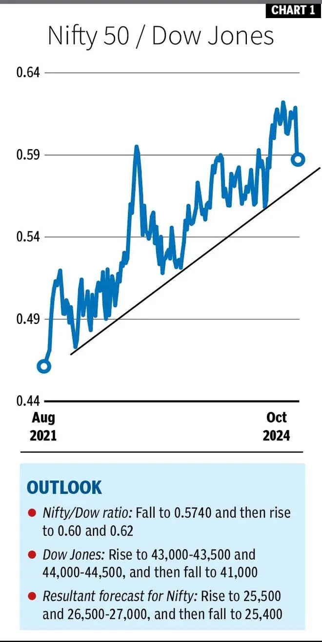
More rise
The Nifty/Dow ratio is currently at 0.5824. On the charts, the trend is down. The ratio can fall to 0.5740 from here in a month or two. In this period, the Dow Jones will outperform the Nifty. Thereafter, the ratio can rise to 0.60 by the end of this year. As we head into 2025, the ratio chart can extend its rise towards 0.62 in the first quarter next year.
The Dow Jones is looking bullish. It can rise to 43,000-43,500 in a month or two, and then target 44,000-44,500 by this year-end. Thereafter, the index can run into a correction. So, a reversal from 44,000-44,500 can drag the Dow Jones down to 41,000 in the first quarter next year.
Translating this into Nifty, we get a range of 25,000-25,500, as the ratio falls to 0.5740 from here. Nifty can rise to 26,500-27,000 as the Nifty/Dow Jones ratio goes up towards 0.60. From there, a corrective fall to 25,400 is a possibility as the ratio goes up to 0.62 and the Dow Jones falls to 41,000.
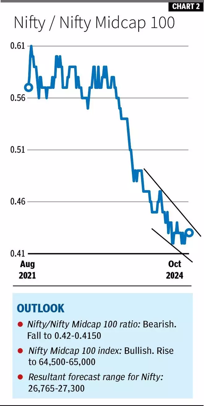
Nifty Vs Midcap
The Nifty Midcap100 index (59,213) has a strong support at 56,800, from where it is bouncing back now. The outlook is bullish. The index can rise to 64,500 and 65,000 by the end of this year.
The Nifty/Nifty Midcap 100 ratio is currently at 0.43, . The bias is negative to see a fall to 0.42-0.4150.
So, for a range of 64,500-65,000 on the Nifty Midcap 100 and 0.42-0.4150 on the Nifty/Nifty Midcap 100 ratio, we get a forecast range of 26,765-27,300 for the Nifty. That gives an average of 27,033.
Sectoral outlook
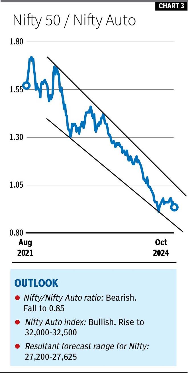
This time, we have identified two sectors that can outperform the Nifty for the rest of the year. Like last year, Pharma finds a place again this time also. Along with that, we can expect the Auto sector to outperform the Nifty, going forward. Here is the ratio chart analysis of the Nifty Pharma and Nifty Auto indices to see where the Nifty is headed.
Nifty/Nifty Auto: The Nifty/Nifty Auto ratio has been in a strong downtrend for almost three years now. However, there have been intermediate corrections within that. The ratio is currently at 0.94. It can fall to 0.90 from here. Eventually, the ratio can break 0.90 and extend the fall to 0.85.
The Nifty Auto index (26,437) has good support at 25,150. The outlook is bullish. The index can rise to 32,000-32,500 in the next three months.
As the index goes up to 32,000-32,500 and the ratio falls to 0.85, the Nifty can rise to 27,200-27,625 in that period.
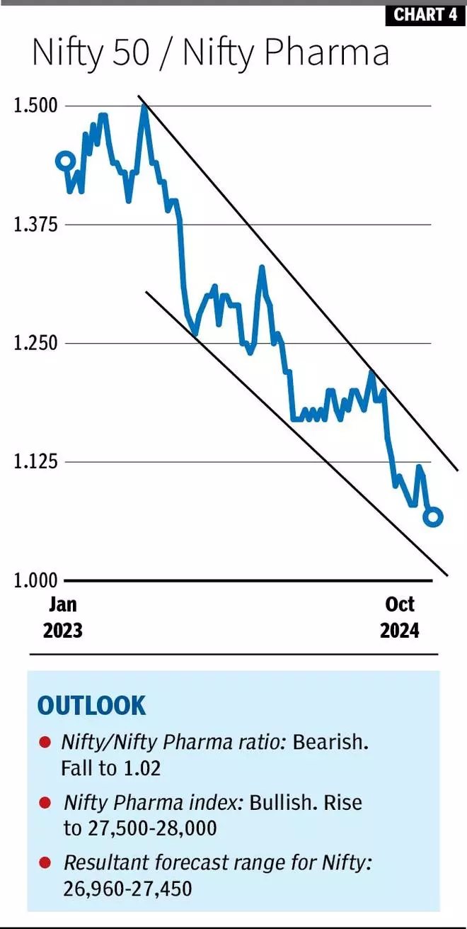
Nifty/Nifty Pharma: The ratio peaked in May 2023 and has been declining since then. The ratio is currently at 1.06. It can fall to 1.04-1.02 from there.
The Nifty Pharma index (23,582) is looking bullish for a rise to 27,500-28,000 from here. Support for the index is at 22,600.
So, if the ratio falls to 1.02 and the Nifty Pharma goes up to 27,500-28,000, Nifty can see 26,960-27,450.
Take Away
All the ratio chart analysis above indicates that there is room for Nifty to go further from here for the rest of the year. They indicate that Nifty can find a top anywhere in the 27,000-27,500 region by this year-end. Thereafter, a corrective fall is likely as we head into 2025 as indicated by the Nifty/Dow Jones ratio chart analysis.
We have restricted the above study to only one leg of move in Nifty — a rise to 27,000-27,500. It is because, except for the Nifty/Dow Jones, other ratio charts do not give a clear picture beyond one leg of move that we have predicted above in each section. So, once the Nifty makes a peak and then turns down, we can revisit the ratio charts to gauge the quantum of correction that can happen.
![]() Comments
Comments

Comments
Comments have to be in English, and in full sentences. They cannot be abusive or personal. Please abide by our community guidelines for posting your comments.
We have migrated to a new commenting platform. If you are already a registered user of TheHindu Businessline and logged in, you may continue to engage with our articles. If you do not have an account please register and login to post comments. Users can access their older comments by logging into their accounts on Vuukle.